CROSSLAND CARPENTRY
LOGO
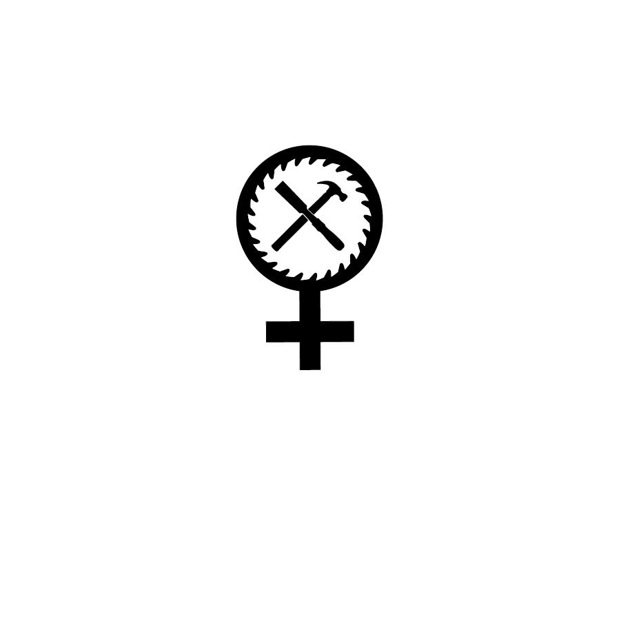
Crossland Carpentry is a woman owned carpentry small business in Portland, OR. I created a logo for them that conveyed the ruggedness of the Pacific Northwest and also highlighted being a woman owned business.
LOGO APPLICATION
WOOD BRAND
The client requested a simple icon design to be used as a wood brand to brand their finished pieces.
BRAND COLORS
Colors were chosen that reflect the crisp mountain air and woods of the Pacific Northwest.

LOGO SINGLE COLOR
PROCESS SKETCHES
The client requested an “X” be in the icon to convey the “cross” in “Crossland”. Using a hammer and chisel as the “X”, I integrated the concept into many different configurations also utilizing the feminine symbol and saw blade shapes.
TIGHTROUGHS
Four designs were developed, the top two being slight alterations of the same design. The client decided to move forward with the third design.

FINAL LOGO
The font was changed from a condensed sans-serif font to wider slab serif. I made this change to reflect the angles and shape of the icon and to give the logo a more retro feel rather than the more modern sans-serif. The orientation was also changed, moving the word mark to the side rather than stacked as it has better visual balance this way with the slab serif font.
